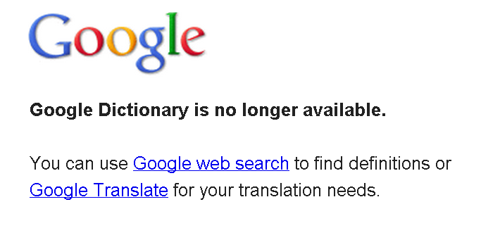
However, today when I typed the URL of Google Dictionary into the address bar, I saw the message that's in the above screenshot—Google Dictionary is no longer available!
So I began searching the Internet for more information, and this is what I found:
Google Dictionary was recently integrated into Google Web Search. Simply search for "define X" where X is the word you want to look up. Clicking on the "more" link (or on the toolbelt "Dictionary" link on the left) will give you practically the same experience that was available on dictionary.google.com.This is just stupid. By incorporating Google Dictionary into the Google Web search, Google is making the dictionary feature much harder to use. Here are the reasons:
We're working hard to make the dictionary experience even better on google.com so it will be easier for our users to get the dictionary experience without the need to go to a separate property.
1. Poor Accessibility
It's much harder to access now. In the past, the URL for Google Dictionary was so simple that one could just type it into the address bar. It was google.com/dictionary
Now,the typical URL of a dictionary search page is: http://www.google.ca/search?q=best+dystopian+novels&hl=en&safe=off&prmd=ivns&ei=scY0TvPXHMGcgQeX27yEDQ&start=10&sa=N&biw=740&bih=396#sclient=psy&hl=en&safe=off&tbs=dfn:1&source=hp&q=hello&pbx=1&oq=hello&aq=f&aqi=g10&aql=&gs_sm=e&gs_upl=858l107460l2l107610l7l7l1l0l0l0l174l707l2.4l6l0&bav=on.2,or.r_gc.r_pw.&fp=dfa68eb25e59583b&biw=740&bih=396.
See the difference!? Now it'd be impossible to type the URL into the address bar! Instead, one has to go to google.com→ type "define (word)" → press the "search button"→press the "more" link!
The dictionary has become so much harder to access!
2. Bad Layout
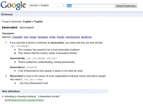
Originally the layout of Google Dictionary was great because the page was extremely simple:
 |
| With this layout, you can see the definition(s) and synonyms very easily |
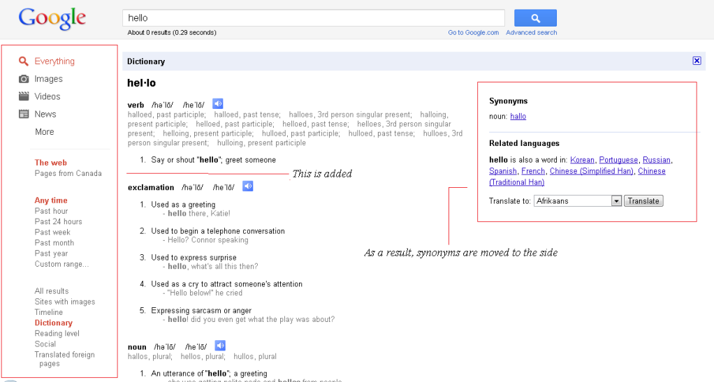
However, after it is integrated into Google Web Page, the whole page becomes cramped because of the annoying tool-belt thing on the left:
This may not seem that bad if you view the page at 100% zoom. However, if you view the page at 200% zoom, it would become a huge problem. The page would become too wide, and the synonyms will come off-screen. At the same time, a huge portion of the page would be occupied the useless tool-belt.
 |
| Click to enlarge image |
---
Conclusion
Why would Google do such a terrible thing? By doing so, it clearly isn't doing the users any good! Not only does it become harder for the users to actually reach the dictionary page, it also becomes harder for the users to use and view the page!
Also, why couldn't Google keep the Google Dictionary page even if this new feature was added? Is it because the cost is too high? Or is it because they actually believe that no one will dislike their poor, new feature?

